JIMI POKER

Jimi Poker is a name that has really grown on me, so creating a look and feel for it was fun but challenging. The aim was to create an identity that has the chance to evolve over time


The icon is a combination of a lightning bold and a pencil. Merging the idea of fast creative ideas yet keeping the reality that every idea is written down on paper first


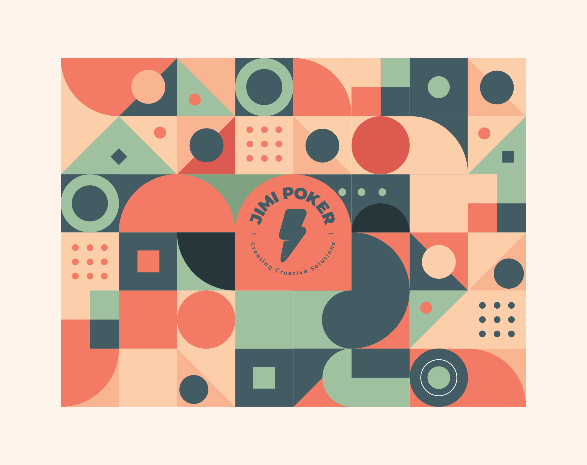
The patterns are created to represent how various elements built up in a process create a a picture. That’s how I view design, a final composition built up over various parts, from imagery to text, all creating one piece.
Even though we live in an era where most creative is interacted with on a digital platform, there’s still a great beauty in traditional design. I’ve found myself in situations where I’ve been asked for a business card, so you can never go wrong with having the basics


The icon is a combination of a lightning bold and a pencil. Merging the idea of fast creative ideas yet keeping the reality that every idea is written down on paper first
The patterns are created to represent how various elements built up in a process create a a picture. That’s how I view design, a final composition built up over various parts, from imagery to text, all creating one piece.
Even though we live in an era where most creative is interacted with on a digital platform, there’s still a great beauty in traditional design. I’ve found myself in situations where I’ve been asked for a business card, so you can never go wrong with having the basics