Instagram
Interface Redesign
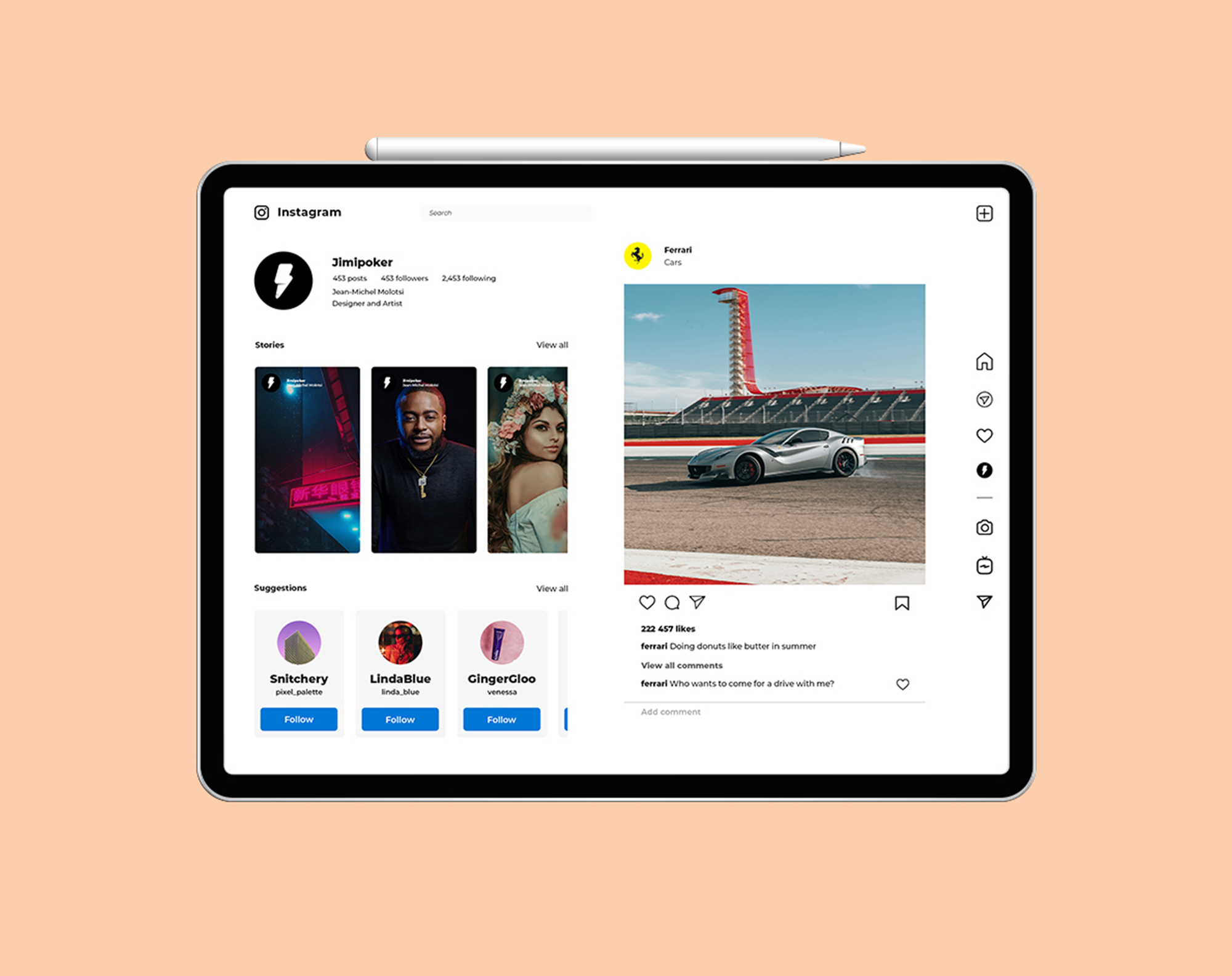
Instagram has a huge following. Mainly designed for as a mobile application, it does not utilize bigger screens such as a tablet and desktop. For fun, I decided to redesign Instagram, keeping the functionality the same but utilizing the extra screen space that is currently not used. Just for fun
First step
Wireframe
Like mentioned above, the aim wasn’t to reinvent the wheel, but just to try add bigger rims to the entire thing. Creating a layout that uses more of the available screen while function the same
Result
User interface
Once I was happy with the wireframe, I simply used the same elements on the current application. Like I said, we’re using more of the screen
Logo
Concept
To be completely honest, I don’t like the current font on the Instagram logo. The logo has grown on me but I feel that that a more modern font would look a lot better, so this is merely a suggestion
First step
Wireframe
Like mentioned above, the aim wasn’t to reinvent the wheel, but just to try add bigger rims to the entire thing. Creating a layout that uses more of the available screen while function the same
Result
User interface
Once I was happy with the wireframe, I simply used the same elements on the current application. Like I said, we’re using more of the screen
Final design
Looking at this little project, I’m happy with it but I’d actually like to use it in person to feel it for myself. It may use more space, but is it more cluttered? I think that depends on the user.
Logo
Concept
To be completely honest, I don’t like the current font on the Instagram logo. The logo has grown on me but I feel that that a more modern font would look a lot better, so this is merely a suggestion
Need your
own website?
Fill in your details
and I'll get back to you
Let's treat like an App
View in portrait
This Vision is way
too small for Jimi
Let's expand the view