Jimi Poker
Website Design
Being a creative that is Pursuing to stand out to other creatives can be a bit challenging, so I tasked myself with creating a website for myself that doesn’t not look like every other website but not too foreign at the same time
First step
Wireframe
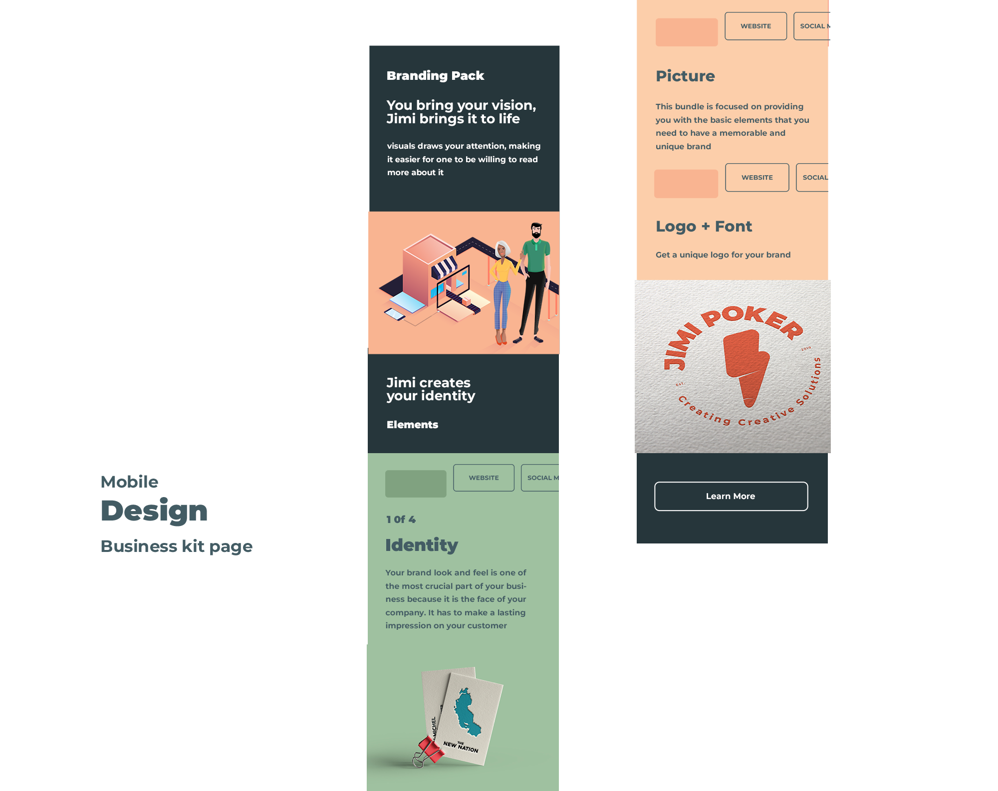
Creating this site came with a few problems. After creating the desktop version I realized that implementing the same layout on mobile would be a little tricky, so to solve this, I created a different user flow for mobile, focusing on creating a mobile app experience that is similar to mobile apps like Instagram
Final
Colorful interface
Having full control over the project was great yet complicated because I have to please myself. I wanted color to separate different skill sets that I offer. Through out the site I focused on using color to separate each skill set and hopefully making easy for the user to know that there are various elements that fall under the umbrella of design
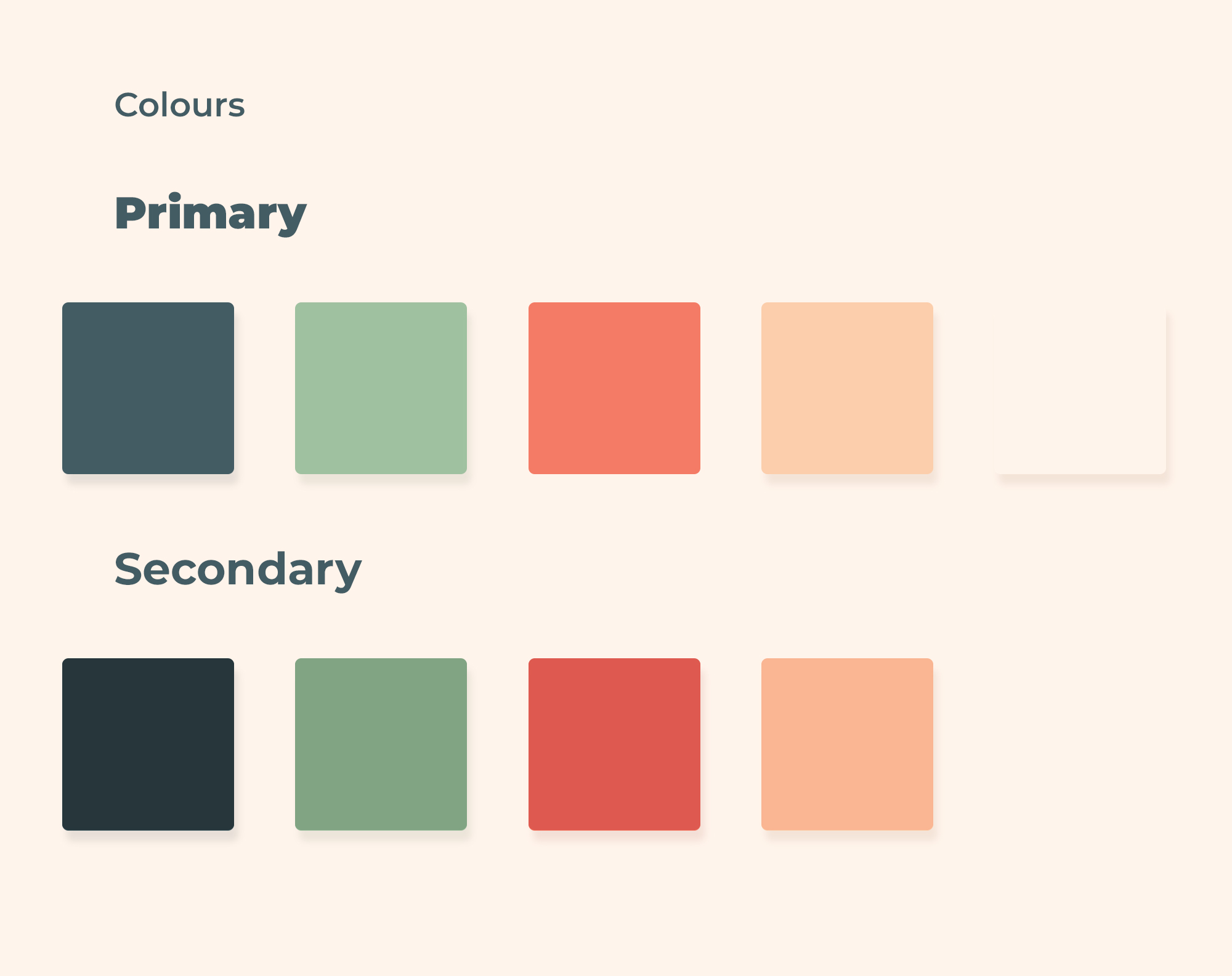
Corporate identity
Logo
The colors of the site work together with the supporting elements of the identity I’ve created for myself. The icon itself represents “lightning fast ideas”, combining the light bolt and pencil. The supporting patterns are for long term use. Creating these base patterns allows me to play with the corporate identity as time goes by.
First step
Wireframe
Creating this site came with a few problems. After creating the desktop version I realized that implementing the same layout on mobile would be a little tricky, so to solve this, I created a different user flow for mobile, focusing on creating a mobile app experience that is similar to mobile apps like Instagram
Final
Colorful interface
Having full control over the project was great yet complicated because I have to please myself. I wanted color to separate different skill sets that I offer. Through out the site I focused on using color to separate each skill set and hopefully making easy for the user to know that there are various elements that fall under the umbrella of design
Final site
Overall, I’m very happy with the final result of this project. I’m keen to see how it unfolds and evolves over time. I feel that this project does represent and showcase my knowledge and my design skills.
Corporate identity
Logo
The colors of the site work together with the supporting elements of the identity I’ve created for myself. The icon itself represents “lightning fast ideas”, combining the light bolt and pencil. The supporting patterns are for long term use. Creating these base patterns allows me to play with the corporate identity as time goes by.
Need your
own website?
Fill in your details
and I'll get back to you
Let's treat like an App
View in portrait
This Vision is way
too small for Jimi
Let's expand the view